
Main page / English / Portfolio / Transportation design / Automotive design / Aquila Racing Cars ApS
Aquila Racing Cars ApS | Finalist in International Race Car Design
Automotive Design | Aquila Racing Cars Competition Finalist | Single-Seater Race Car Design
A prestigious automotive design project that exemplifies Danish automotive design and highlights the country’s excellence in motorsport design and race car engineering. Presented at the Autosport International Show in Birmingham, January 2014, this innovative racing car concept combined performance vehicle concepts with automotive styling, showcasing a bold vision of professional car design
Project Highlights:
- Selected as one of 7 finalists from 27 international participants
- Collaborative design with renowned designer Torben Nyegaard Poulsen
- Two-phase development process spanning 10 weeks
- Featured advanced 3D modeling using Alias StudioTools and KeyShot
- Innovative aerodynamic solutions including water-droplet inspired fenders
- Exhibited at Aquila's stand during the Autosport International Show 2014
The project began with a two-week initial concept phase, followed by an eight-week detailed development period. The design stood out for its ambition and unique approach to aerodynamics, featuring distinctive water-droplet-inspired fenders and integrated body-wing architecture. By blending dedication, motivation, and expertise, the final result balanced performance and aesthetic appeal, reflecting Aquila’s visionary design language while setting new standards in international racing competition.
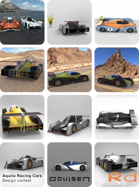
2nd Phase: The Final Design for Aquila Racing Cars – Design Optimization
In the next phase of the project, we had more time to refine the design and dive into the details. We thoroughly analyzed how other race cars are constructed and collaborated closely with an engineer to gain deeper insights into race car engineering and aerodynamics. Among other things, we learned that an efficient front air intake requires a carefully planned exhaust point at the rear.
The deadline for the second submission was January 3, 2014, but as both Torben and I planned to go on holiday starting December 17, we worked intensively to complete the project before then. We managed to finish and submit our design via email on December 17.
About the Design
In this phase, we focused particularly on the fenders, which turned out to be one of the most complex parts of the design. Although they appear simple, the challenge lay precisely in their simplicity. The concept was for the fenders, when viewed from above, to resemble two water droplets facing opposite directions, embodying modern design and innovative solutions.
The biggest challenge was the center cut between the fenders, visible from the side of the car. Both projects demanded significant time to perfect the fenders, highlighting the importance of dedication and ambition to achieve extraordinary results.
The body of the car followed the same general concept as the first design but included several improvements. We merged the body and wings into a cohesive form, where they had previously been separate components. The new chassis made it easier to design air intakes and outlets, resulting in a more integrated design, reflecting the core principles of Danish automotive design.
Styling the Car
With the basic shape established, we began styling the car and refining details such as the windshield. Drawing from Aquila’s design language, we incorporated their signature details. Torben and I were determined to refine the design continuously, leading to frequent adjustments – a process driven by motivation and a goal-oriented approach.
Some elements from the original design were retained, such as the front grille, to which we added an extra chrome detail. The only components reused directly from the previous 3D model were the side mirrors, which were repositioned due to the altered shape of the fenders.
The car’s width and length remained unchanged from the original design. The final result exemplified how visionary design and professional car design come together to create something truly exceptional.
Move the mouse over the image and press the left button to interact.
More information on animation VR
Final Design Images
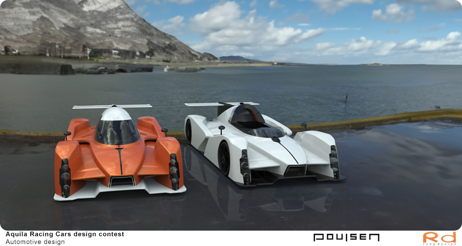
This image showcases the front design of the Aquila race car, where functionality meets aesthetics. Created in Alias StudioTools and rendered in KeyShot with a focus on aerodynamics. Collaborative design with Torben Nyegaard, finalist among top seven designers, showcased at Aquila's exhibition in January 2014.
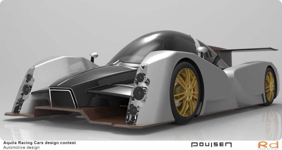
A close-up of the race car's fender and air intake, highlighting the advanced 3D modeling and precision in design.
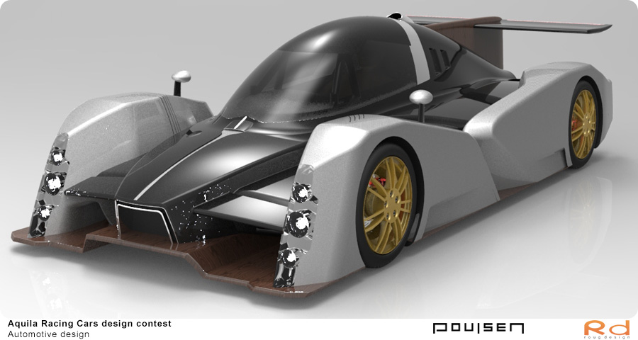
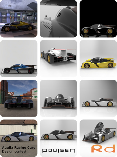
This perspective image shows the dynamic front with sharp lines and aerodynamic details, emphasizing the car's form.
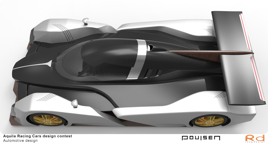
The top angle reveals the car’s organic design inspired by water droplets and the seamless integration of body and wings.
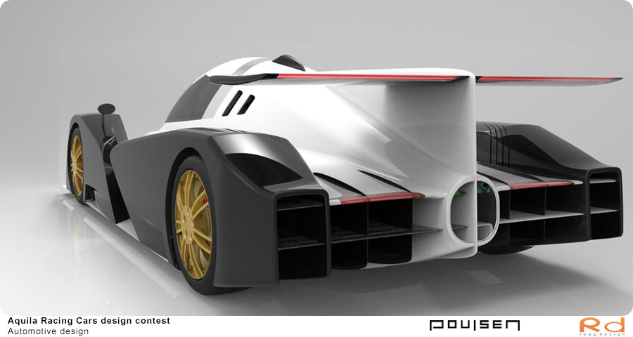
The rear end shows an innovative approach to aerodynamics with optimally placed air outlets and a powerful rear spoiler.
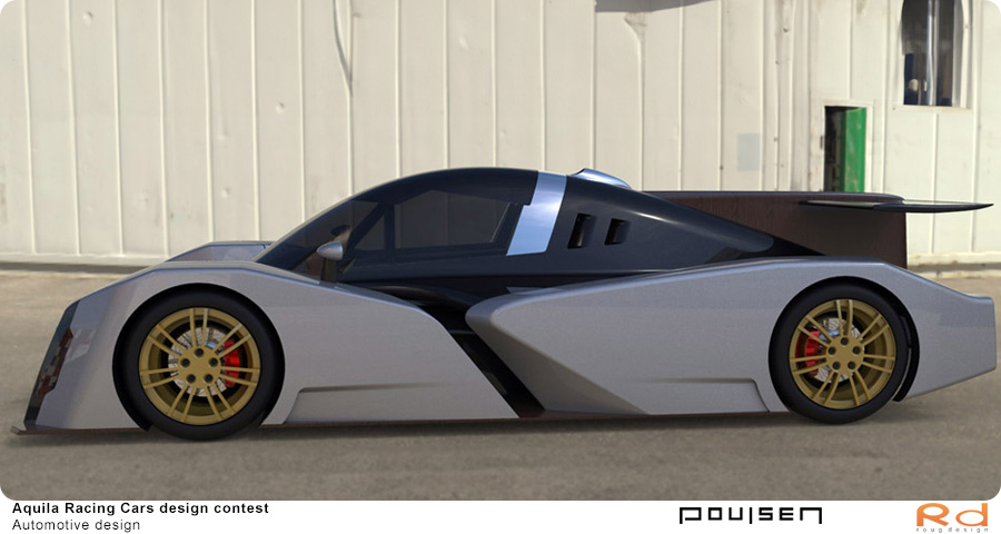
The side profile highlights the streamlined shapes, fender details, and striking wheels. An example of Danish transport design.
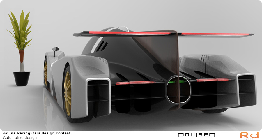
Here, the car’s rear tail and spoiler are shown, where design and functionality meet for optimal track performance.
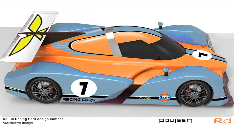
Image displays a colorful interpretation of the Aquila race car with an iconic Gulf-inspired color scheme, emphasizing its styling.
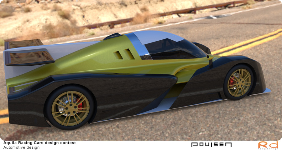
A visualization of the race car’s design in a realistic environment, conveying a sense of motion and shape.
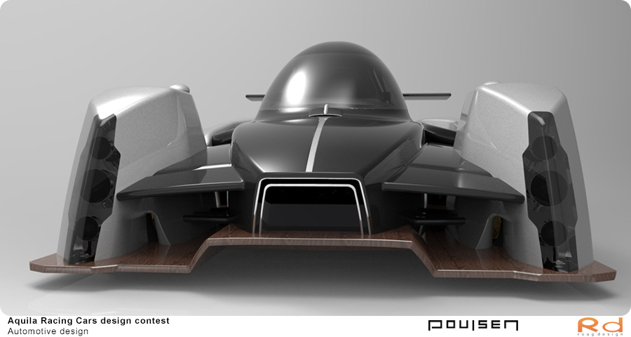
This image highlights the distinctive front grille, precise lines, and the integration of functional details like air intakes.
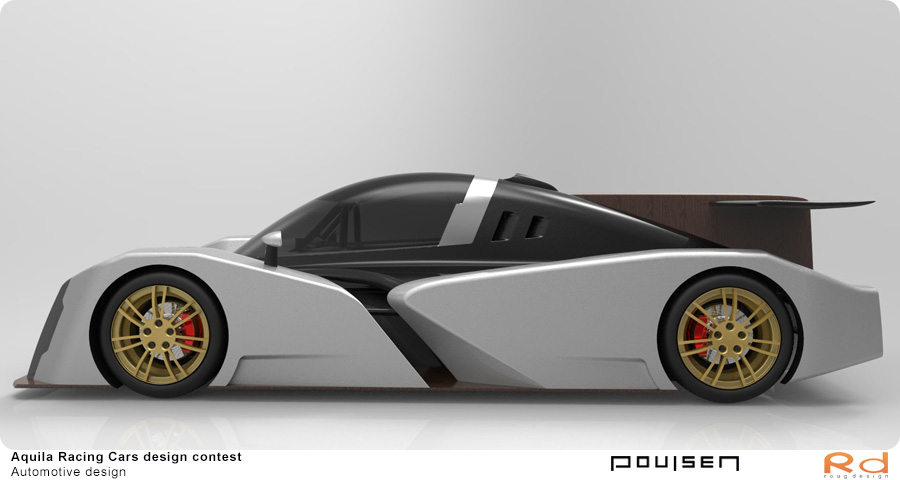
The side profile of the race car design highlights the streamlined lines and precise details ensuring optimal aerodynamics.
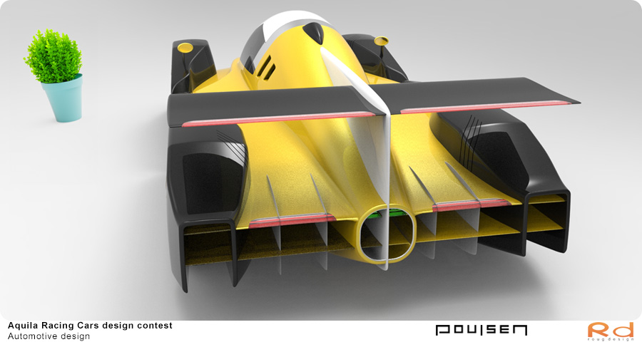
This image showcases the race car’s prominent rear spoiler and air outlets in a stylish gold design that enhances airflow.
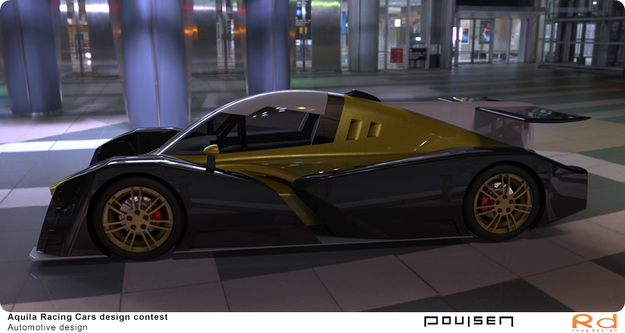
The gold-and-black race car visualized in an urban setting, where lights and reflections emphasize the car’s details and form.
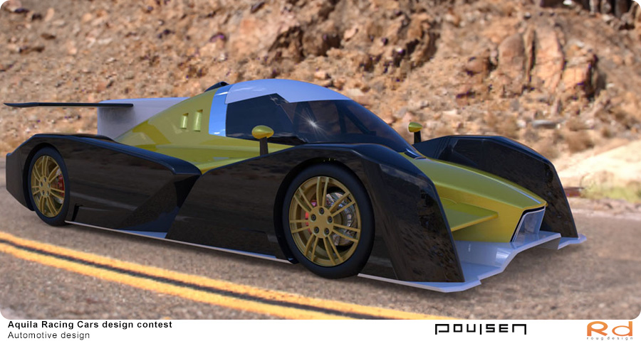
A realistic visualization of the race car’s design on a mountain road, where form and function meet in a natural setting.
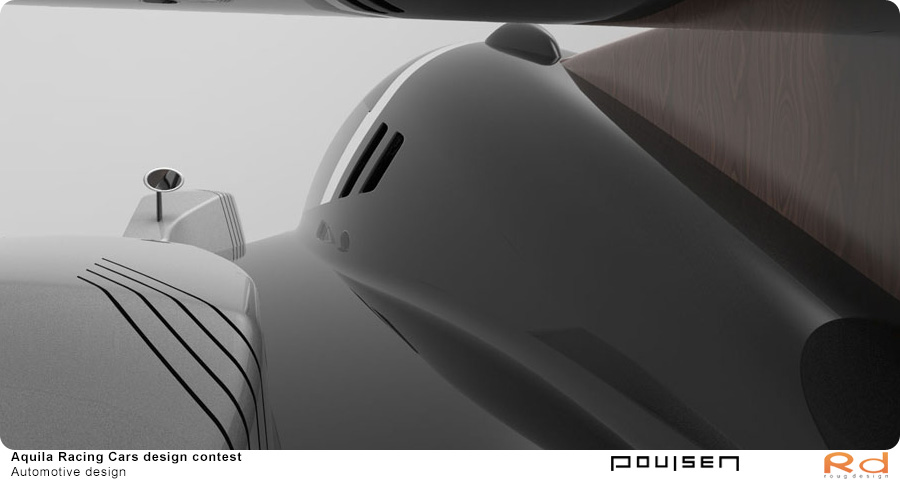
The image highlights the car’s smooth surfaces and aerodynamic shapes from above, an example of advanced 3D modeling.
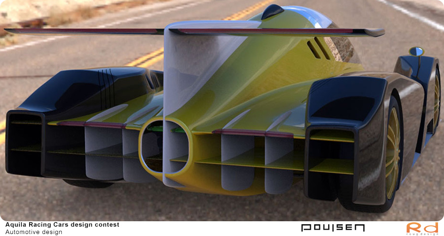
The rear end of the race car’s design with striking air outlets and a powerful rear spoiler in a realistic road setting.
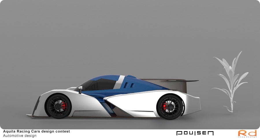
A stylish version of the Aquila race car in a clean blue-and-white color scheme, emphasizing the car’s form and elegance.
Article | Racecar Engineering | Aquila’s Social Engineering Project
As part of my participation in the prestigious Aquila Racing Cars design competition, my design was featured in Racecar Engineering, a renowned engineering magazine. The article highlights the journey of the seven finalists, focusing on their innovative concepts and the creative process behind their designs.
This publication offers valuable insights into the competition and showcases the importance of race car engineering and automotive styling in modern motorsport.
Click on the image to read the full article and gain insight into the excitement of the competition and the creative process behind the designs.

1st Phase: A Concept and Description of the First Submission
I decided to enter the competition about two weeks before the deadline, as I was curious to see the chassis, but I didn’t have much time. Therefore, I teamed up with Torben Nyegaard Poulsen, who quickly sketched a design. From this sketch, I began building the 3D model using advanced 3D modeling tools, an essential part of modern car design.
Meanwhile, Torben added some details to the top view drawings, which I assumed were meant to be serious. This motivated me to work diligently on refining the details on the fenders, showcasing the importance of dedication and ambition in achieving professional car design. It later turned out that Torben hadn’t put much thought into those specific details, but they ultimately made the fenders more dynamic and visually appealing – a hallmark of automotive styling.
A few days after submitting the project, I received an email informing me that Aquila had postponed the evaluation of the projects. It took some time before I received confirmation that we had progressed to the next round. The email also included a detailed review from three judges, highlighting areas for improvement in the concept. Some of the feedback was highly technical and written in English, offering valuable insights into the expectations of race car engineering and performance vehicle concepts.
At the end of the email, I was asked if I wanted my name mentioned on their Facebook page, which I gladly accepted.
It turned out that there were 27 participants, and seven of us advanced to the finals. This recognition underscored the significance of motorsport design and Danish automotive design in an international racing competition.
Move the mouse over the image and press the left button to interact. More information on animation VR
Summary of the Aquila Racing Cars project
The Aquila Racing Cars project highlights a remarkable blend of Danish automotive design, innovation, and technical expertise. From the initial concept phase to the final design, the project showcased how motivation, dedication, and a focused approach to race car design can lead to results that are both visually striking and highly functional. As a finalist in an international competition, the project demonstrated the value of collaboration and a strong vision. This project stands as a tribute to Danish transportation design and an inspiration for future designers.